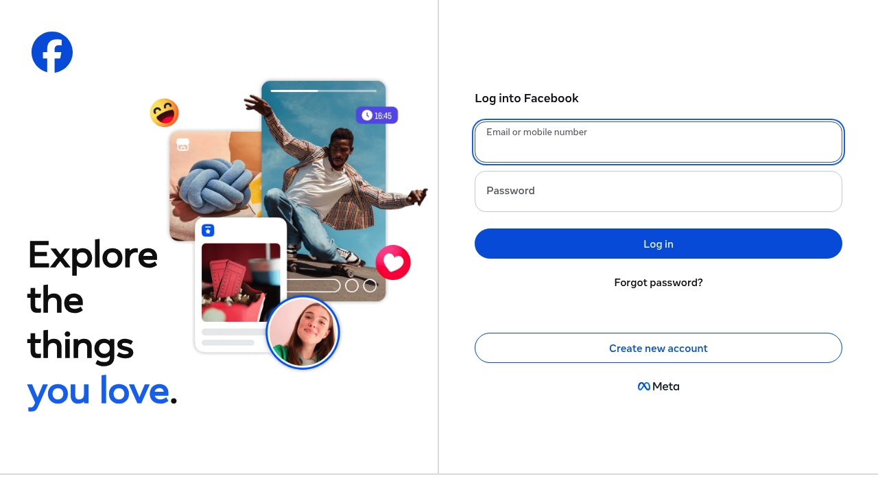
This landing page is a freaking mess, it's like Facebook threw a bunch of crap on the wall and hoped something would stick. The first thing you see is a login form, because who doesn't want to log in to a social media platform without knowing what the hell it's about? The headline is nonexistent, the subheadline is a joke, and the primary CTA is just a boring old login button. It's like they're not even trying to convince you to join, they just assume you'll be desperate enough to sign up.
The features are a mystery, the testimonials are nonexistent, and the pricing is free, because who needs to make money when you can just sell your users' data to the highest bidder? The design is straight out of the early 2000s, it's like they raided a time capsule and said "yeah, this is good enough". The language options are a joke, it's like they just copied and pasted a list of languages from Wikipedia without even bothering to translate the rest of the page. And don't even get me started on the Meta crap, it's like they're trying to create some kind of meta-universe or something, newsflash Facebook, you're not Marvel.
The CTA is just a login button, because who needs a compelling reason to sign up when you can just have a boring old button? The offer is nonexistent, it's like they're not even trying to convince you to join, they just assume you'll be desperate enough to sign up. And the conversion logic is just a bunch of tracking scripts and data collection, because who needs to actually provide value to your users when you can just sell their data to advertisers? It's like Facebook is just a giant data harvesting operation, and the actual social media platform is just a side gig.
The design is a disaster, it's like they hired a bunch of interns to throw together a page and hoped for the best. The layout is cluttered, the fonts are ugly, and the colors are straight out of a bad 90s website. It's like they're trying to blind you with a mess of links and buttons, and then they have the nerve to ask you to log in, like you're some kind of idiot who can't even navigate a simple website. And the Meta links at the bottom, oh boy, it's like they're trying to create some kind of meta-universe or something, with Meta Pay, Meta Store, and Meta Quest, it's like they're trying to be some kind of tech giant or something, but really they're just a bunch of delusional idiots.
This page is a trainwreck, it's like Facebook took all the worst design trends of the past 20 years and mashed them together into one big mess. The fact that this is one of the most popular websites in the world is a testament to the fact that people will put up with just about anything if it's free and has a lot of users. But let's be real, this page is a disaster, and if I had to use it, I'd probably end up throwing my computer out the window in frustration, so yeah, that's Facebook for you, a giant mess of a website that's only good for one thing, wasting your time.