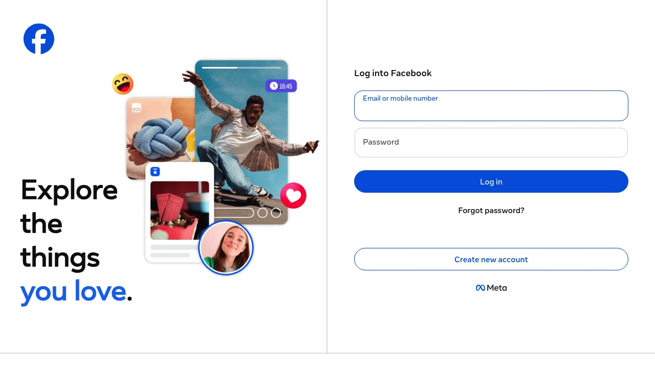
Imagine this, a website that's been around for decades, and the login page still says "Log into Facebook" with all the excitement of a sedated sloth. The fact that the headline is missing in action is just the cherry on top of this mess. I've seen better sites built by drunk people at 3am, and those were probably more functional than this loading disaster. Loading so slow it makes me want to flip every table in a five mile radius, all because I have to wait for the "Explore the things you love" part to load, which sounds more like a vague self-help slogan than an actual feature.
Not once, in the entire scroll of this facebook.com page, does it become clear what makes this site so special, aside from the "Create new account" and "Log in" buttons that seem to be staring at me like empty voids. The "Email or mobile number" and "Password" fields are just begging to be filled with fake information, because who needs security, right? Built with the aesthetic vision of a broken kaleidoscope, this page is a mess of links and buttons that seem to lead nowhere. The fact that the only visible text is "English (US)" and a bunch of other languages just adds to the confusion, like a bad game of linguistic twister.
For the love of conversion, who designed this abomination and thought it was a good idea to hide the actual features of the website behind a login wall? "Explore the things you love" is just a vague promise, a crap shoot in the dark, with no actual substance to back it up. I mean, what things am I supposed to love? The fact that facebook.com has been around for so long, or the fact that it's still using the same old design? Whoever wrote this code and called it done has some serious fucking audacity, thinking that this would be enough to convince people to join. Newsflash: it's not.
At no point, while scrolling through this disaster, did I feel like I was on a website that's supposed to be a social media giant. The "Messenger", "Video", and "Meta Pay" links just seem like afterthoughts, tacked on to the side of the page like an apology. And don't even get me started on the "Ray-Ban Meta" and "Meta AI" links, which sound like something a try-hard startup would come up with. I've seen better-designed websites on a fridge, and those were probably drawn by a toddler. This facebook.com page is a kitchen disaster, a recipe for confusion and frustration, with a dash of crap design and a whole lot of loading issues.