
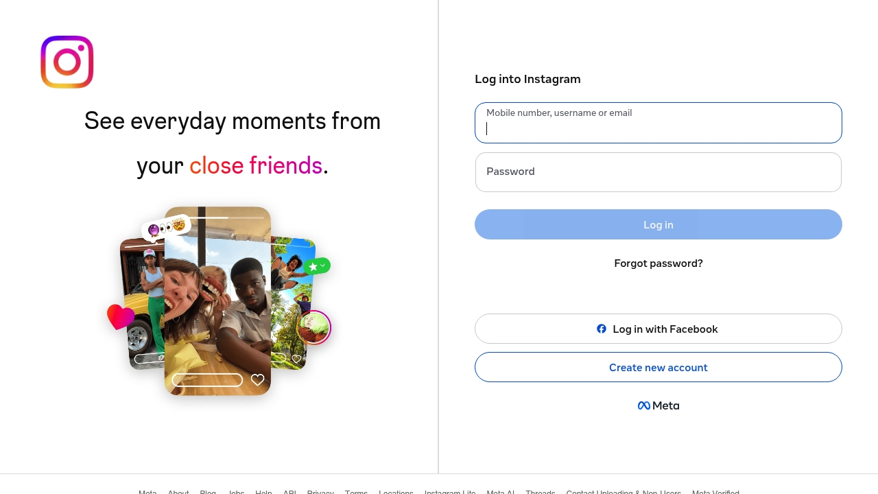
Not once does the phrase "Log into Instagram" make me feel like I'm about to experience something revolutionary, yet here it is, staring me in the face like a bad omen. The fact that the title of the page simply says "Instagram" and nothing more is a bold move, or rather, a lack of one. I mean, what's the point of having a headline if you're not going to use it to say something, anything, of substance. This site's information architecture was designed by someone who failed Tetris, and it shows in the way they've managed to cram a login form, a create new account button, and a plethora of links into a space that's supposed to be sleek and minimal.
Against all odds, the most exciting thing on this page is the "Forgot password?" link, and that's only because it's a reminder that even the most mundane tasks can be frustrating. The padlock icon is just decorative at this point, because let's be real, this site's security is about as robust as a house of cards. "See everyday moments from your close friends" is the only real snippet of copy on this entire page, and it's a vague promise that doesn't really deliver. I mean, what does that even mean, exactly. It sounds like something a grandma would say to get you to use the site, not an actual selling point.
Somehow, the team behind instagram.com managed to create a navigation so confusing it came with a grief counselor. I'm not even kidding, the number of links at the bottom of this page is staggering, and none of them seem to be particularly relevant to the task at hand, which is, you know, logging into Instagram. "Log in with Facebook" is a nice touch, I guess, but it's not like that's a unique feature or anything. It's just a reminder that this site is built with zero fucks, deployed with confidence, and it shows. The fact that they've got a separate link for "Instagram Lite" is just the cherry on top of this mess.
Let us talk about the fact that the only real call to action on this page is "Log in" or "Create new account", neither of which are particularly compelling. I mean, who gets excited about logging into a social media site. The fact that they've got a link to "Meta" at the bottom of the page is a nice touch, I guess, but it's not like that's going to make me want to use the site more. "English" is the language of choice, apparently, because who needs options, anyway. The whole thing feels like a half-baked mess, and the fact that it's still up and running is a testament to the power of brand recognition, because it's definitely not the design or user experience that's keeping people coming back.