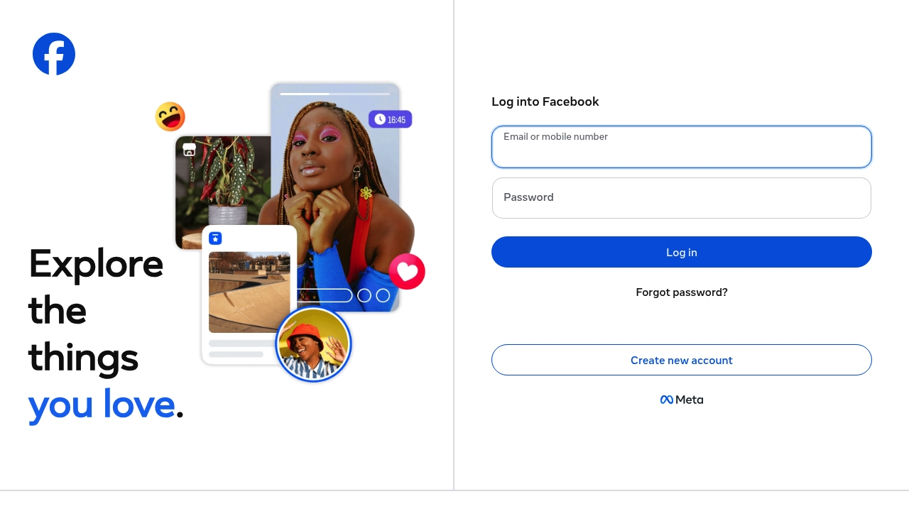
For the love of conversion, visiting https://facebook.com/ is the digital equivalent of stepping in shit with socks on, it's a mess from the start. The first thing you see is a login form with the option to "Log into Facebook" or "Create new account", because apparently, that's all the introduction you need to this platform. The fact that the headline is unknown says a lot about the overall lack of direction on this page. It's like they took every possible feature and just threw it at the wall, hoping something would stick.
Not once does the phrase "Explore the things you love" make an appearance in a way that feels authentic or meaningful. It's just tacked on at the top like an afterthought, a half-hearted attempt to seem interesting. The real focus is on getting you to log in or sign up, with links to "Messenger", "Facebook Lite", and "Video" scattered everywhere. More ads than content - bold strategy, truly. The fact that they're trying to push so many different products at once makes it feel like they're not really sure what they're doing. I've seen faster loading screens on a Game Boy, and at least those had the decency to be straightforward about what they were doing.
At no point does the design of this page feel intentional or well-thought-out. Helvetica is somewhere weeping softly at the sheer lack of typographic consideration on display. The links to "Meta Pay", "Meta Store", and "Meta Quest" are just kind of... there, taking up space without adding any real value to the user. And don't even get me started on the language options, which are presented in a way that feels like an afterthought. "English (US)" is the default, because of course it is. The whole thing feels like a mess, and the fact that the pricing and features are unknown just adds to the sense of confusion.
Imagine this, you're trying to decide whether or not to join Facebook, and the first thing you see is a wall of text with a big "Log in" button. It's not exactly the most welcoming experience. Against all odds, the one thing that does stand out is the "Explore the things you love" tagline, but even that feels like a hollow promise. The fact that they're trying to get you to sign up without giving you any real reason to do so is just baffling. This site is a perfect example of how not to do conversion rate optimization, and the fact that it's still up and running is a testament to the power of brand recognition. But let's be real, if this were any other site, it would have been shut down years ago.